Of All Creation!!!
Growing up I was constantly told that I was creative, most things I come up with right on the spot, these random fits of inspiration can be annoying especially when I'm unable to act upon them. Other ideas are drawn out and take longer to form. If you talk to me about Lego's or erector set, I was known to spend hours in my room to create wonders. As far as drawings, I can draw, still do now and again, but this, graphics truly allows me to bring some images to life and make them something else. I know how to use Photoshop, Illustrator, InDesign, Audition, Premiere Pro. But I also have had exposure to other programs such as Cinema 4D, Blender, Audacity, Gimp (which is a Linux-based program). All are good programs, they have their drawbacks, but everyone has their preference.
My portfolio is three parts - Graphics, Web, and Extra's. You're currently on my graphics section. Click one of the following images to go to my web-based or Extra's items.

Graphics
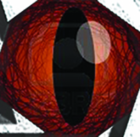
Photoshop Tunnel - This was something I've always seen, but had never attempted. Drawing it was nearly a hand-cramping journey, and any other method couldn't hold a straight-line for anything. But I decided to try it here, course it was a simple exercise. Screen-save the image, paste-it, and repeat about 20 times until it looks never-ending. A fun starter project I did in my free-time.
Paradox - I had an interesting assignment in a music class I was taking during college. The task was to come up with a group and talk about the music they would produce, their attitude, their goals, their instrumentation, that sort of thing. Ladies and Gentlemen may I present, Paradox!
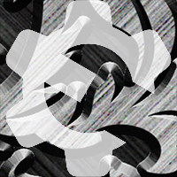
Simplicity again, I overlayed two images, but one of them was copied, flipped, and then a balance of overlay, opacity, and layer order produced this wonder.
Light Focus - This was an introduction piece for three dimensional design, 3D design. I am a little proud of this one for all the manipulation that was involved, having a light source, changing the light's color, the shadow's color, the intensity and brightness and just looking at how everything is cast all aglow.
Church Cover - I was working with a group outside of class, when we were approached about re-doing a church booklet. We looked at it and found a lot of things that we didn't like design wise. So we divided up the work and I decided to do the cover. Though I must agree the back-cover was a little too dark for a church thing, I still liked the front. Bending shapes, drawing them, a lot of time with the pen-tool, making them symmetrical, making a color scheme, and then putting it all together. If I took more time I would add some shadows just to give the full 3D effect and not look like a game.
Restoration - I was approached by my instructor about cleaning up a picture, about making it look new. When I saw the file I knew I had a challenge. Since it was photocopied at a slant I first had to align the picture, then the majority of it was using the bursh tool to make the whites look white. The patch and spot healing tool to get rid of dark spots and to make the visible line on the front disappear. Then I changed the saturation to make it brighter, fuller, till what you see.

2013-2014 Fire Calendar - Now this one was a lot of fun, though also scary since it was unorthodoxed being double themes. A lot of work went into this and since I was given few requirements to meet so I didn't hold-back on my creativity. Dragons and Phoenixes, Reds and blacks, blues and whites. The dragon images I changed the Hue and Saturation so they were Red. For the Phoenixes I changed the color saturation making them brighter. I tried to find images with dragons for the holidays to stick with my theme, make the icons as big as the boxes on the days and then layer them underneath the numbers that were typed in for each month.
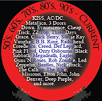
OldSchool Album - This one I am also proud of. I am a musician I play guitar and drums so this has some sentimental value to me. I hooked-up with some other guys on campus and we played around, playing mostly classics from the rock era of my parents age, groups like ACDC, Metallica, Led Zeppelin, Pink Floyd, Journey. So I came-up with a band, the song list, and the album cover. Though it looks complicated, it was actually pretty simple and basic. A pen tool here, some shapes, color fills and gradients, text-wrapping, and then fading certain images to give it that old-school feel.
Audio and Video
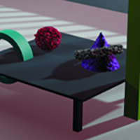
Tronlike - This was my introduction into 3D graphics design, well I should say it was my introduction into the 4th dimension, which is Time. A fun piece, making several objects making them symmetrical. Getting the lighting right, the colors, glows, camera angles and then the travelling of the objects themselves. It was an interesting exercise leading up to this project. A lot of fun and look forward to continuing my work in this area.
Kia Spot - I CLAIM NO RIGHTS TO THIS! ALL CREDITS TO THE ORIGINAL CREATORS OF THIS COMMERCIAL!!! I am merely showing the original cut of this commercial before you look at the other two renditions I did with its audio. The goal of the project was to redo the background audio adding sound effects and even mixxing up the original song. It was definitly an interesing project to say the least...
Kia Spot - Party Rock Remixed - Put simply the original audio was cut-out. For a class the requirements for this project were to add the world famous "Wilhelm Scream", a "whoosh" effect, a re-cut of "Party Rock" by LMFAO, and whatever else we wanted to add. Me I wanted to make it epic. I found a song I wanted to use for the intro before going into party-rock. I also found some laser sound effects, explosions, and even a heart-beat to add tension when the battle paused before, "Every day I'm shufflin".
Kia Spot Rock - By either sheer coincidence or a stroke of genius, my first attempt at this project I didn't catch that we had to re-use "Party-Rock" so I pulled a song from School House of Rock starring Jack Black called "Teacher's Pet". The moment I plugged this song into the video, it fit way too well. This made it epic in another way. While the dance moves clearly do not belong to this song, the beat is spot on. This was a fun piece I keep just to have fun with.
Space-Oddity - This is the biggest project I have ever done for school. This was my final project for #3D graphic design. Put simply a skills assement showing that you know how to use the program, which at that time was Cinema 4D. I already knew what I wanted to do and the instructor placed no restrictions. Of all things I used a song as my focus point, my foundation, "Major Tom" and not the classic version either. I then created my own universe, with a sun, planets, stars, textures, glows, everything. A surprising secret about this project is that most of the objects in it do not move it was just the illusion of the camera moving and certain light effects. The particle emmiters were a challenge especially to make it look like warp-drive. Then the second surprise was the Terraforming, making earth to support life. Again a large scale project that make laptop at the time could barely handle on it's own, I had help from two other systems just to completely render it.